DIGIPOSTE
Redesigning Digiposte
Rethinking the French People’s administrative digital safe

Team: 1 Head of Design, 2 UX Designers, 1 UI Designer
My role: UX Designer
Timeline: 1 year (2023-2024)
Brief: Propose a redesign aligned with new user behaviors and needs.
Format: Web and mobile (Android and iOS)
Language of the project : French
Other version: French 🇫🇷
In short
Overview
Digiposte, used by over 10 million people, helps French citizens securely store and manage administrative documents. After 10 years, the product needed a full redesign to match evolving user habits.
Approach
Using the F.O.C.U.S.E.D Discovery Method, we redefined Digiposte’s positioning from a “digital wallet” to a centralized administrative hub. My work included user research, benchmarking, and prototype testing to improve onboarding, document management, and user engagement.
Outcome
Validated through user testing and beta sessions, the redesign launched in early 2024. It strengthened Digiposte’s value as a daily, long-term companion for managing life’s essential documents.
Full case study
Introduction
Digiposte defines itself as the go-to digital safe for French citizens. With over 10 million users, this 2C solution mainly targeted employees of SMEs and small businesses, thanks to its automatic payslip collection feature. The same system applies to a variety of everyday documents, enabling users to centralize all their administrative lives in one place.
But after more than 10 years of existence and continuous improvement, the conclusion was clear: a complete redesign was needed to meet new user habits!
The design team chose to explore the redesign using the F.O.C.U.S.E.D Discovery Discipline Method.
Framing the Project — Frame
After studying new user behaviors and the rapid evolution of competitors, our goal was to rethink Digiposte as a long-term daily tool: helping users access their essential documents — from student life to retirement.
We first had to define the project ambitions:
Explore digital wallet functionalities to increase monthly active connections.
Choosing a Problem to Solve — Observe
Although the project's ambitions had already been defined before I arrived, I was involved from the Observe phase, where we crafted the Launch Tweet, ready to be tested with users who had never used Digiposte before.

English translation: “Simplify your administrative tasks by keeping all your essential documents within easy reach — securely stored in your Digiposte digital wallet. Stay in control of your data by sharing only what’s necessary!”
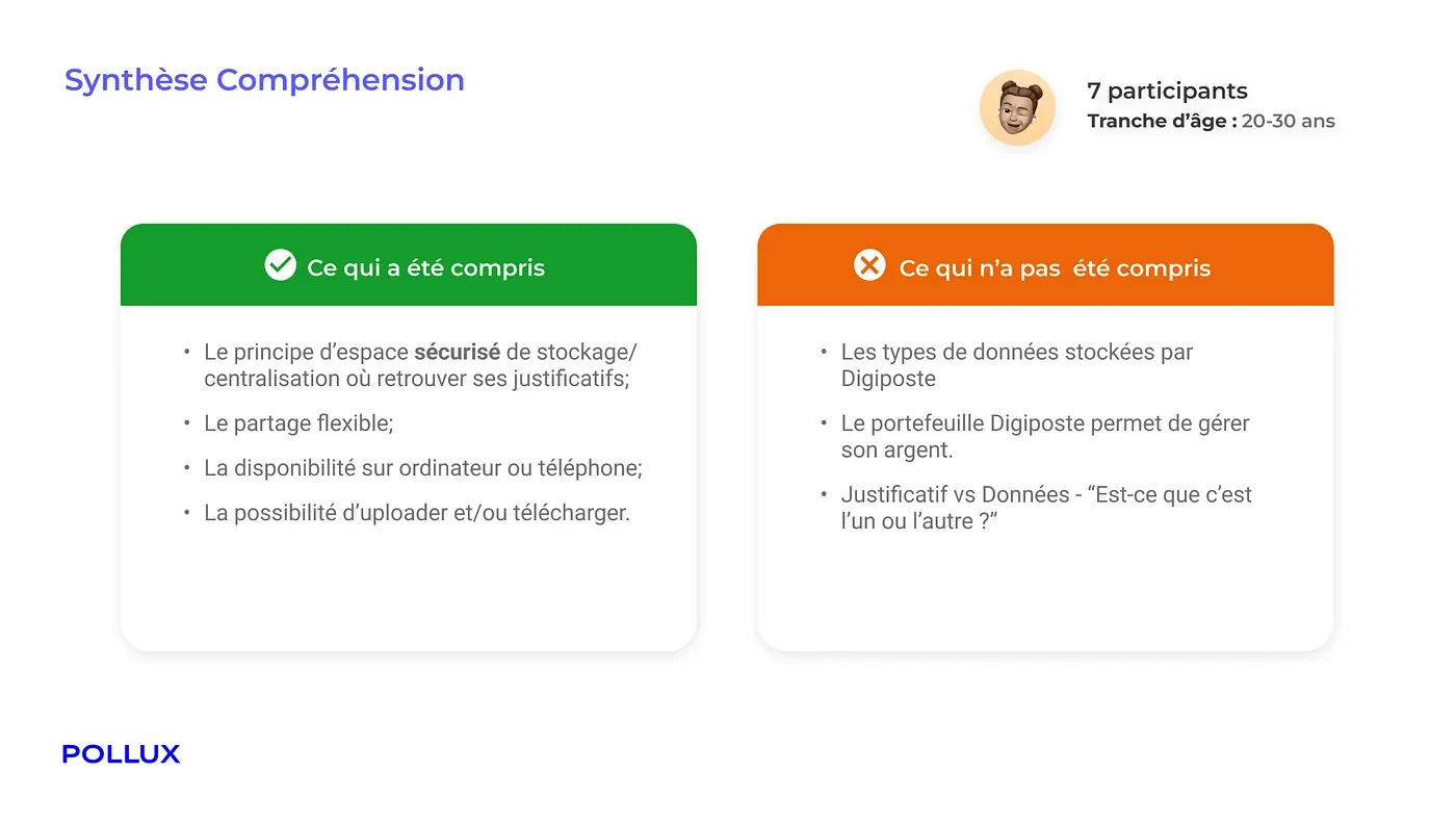
The results revealed some major misunderstandings, such as the association of the term “wallet” with financial management rather than essential personal documents.

We quickly realized that the concept of a wallet was not aligned between users’ perception and Digiposte’s goals.
Selecting Touchpoints — Unfold
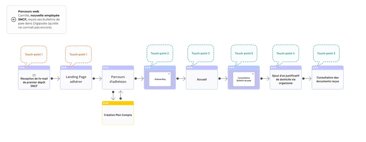
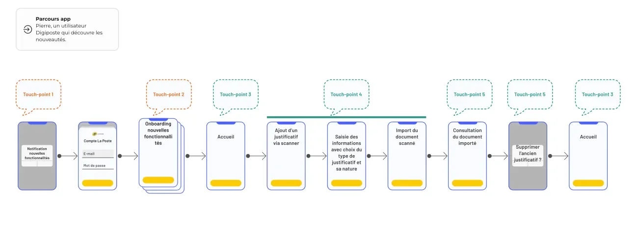
Once the vision was validated via the Launch Tweet, we identified the main use cases we wanted to address and the different touchpoints.

Use Case 1: New HR user

Use Case 2: Existing user encouraged by email

Use Case 3: Existing user manually adding a document
Drawing Inspiration from Other Apps — Steal

I then conducted two benchmarks.
Positioning Benchmark
This first benchmark helped me identify key categories:
Digital wallets, cryptocurrency apps, identity verifiers.
I then analyzed:
User purposes: collecting & storing, presenting to validate a transaction, generating & proving identity, managing crypto assets, categorizing & finding information.
Types of stored documents: transactional (credit card, loyalty card) and official (ID card, driver’s license).
Language elements: vocabulary and tone of voice.
Functional Benchmark
The second benchmark explored recurring features across these categories.
Major themes included:
Centralization of services
Sharing and collaboration
Onboarding experience
Through these analyses, it became evident that Digiposte’s positioning should focus on centralizing administrative documents, rather than being a wallet in the traditional sense.
Once the user journeys were analyzed and developed, we gathered Product Managers, developers, and designers for a “Gold Nuggets” workshop.
The idea was simple: extract the most interesting features from existing screens to draft early versions of what Digiposte could become — on both web and mobile.


Building a Realistic Prototype — Execute
We then built wireframes and user flows in a prototype to test these objectives with users:
How to explain the value of Digiposte?
How to encourage users to complete their Digiposte profile?
How to help users manage their documents effectively?
Testing and Validating the Prototype — Decide
Once validated, a version was shared with a large group of beta testers, in two ways:
Sign-ups via app stores, with questionnaires throughout the experience.
Four in-person beta test sessions with real users.
Thanks to these feedback sessions, we were able to confirm all our hypotheses and prepare for the official launch in early 2024!


Conclusion
As of today, the current online version is the result of two years of redesign.
This project was an excellent introduction for a young designer, as the product maturity and team structure provided a solid and efficient work environment.
It was also a great opportunity to discover and apply the F.O.C.U.S.E.D method on a large-scale project.
Today, I’m proud to have contributed to developing an application that integrated users throughout the research and design process.
